The Renwick
The Renwick
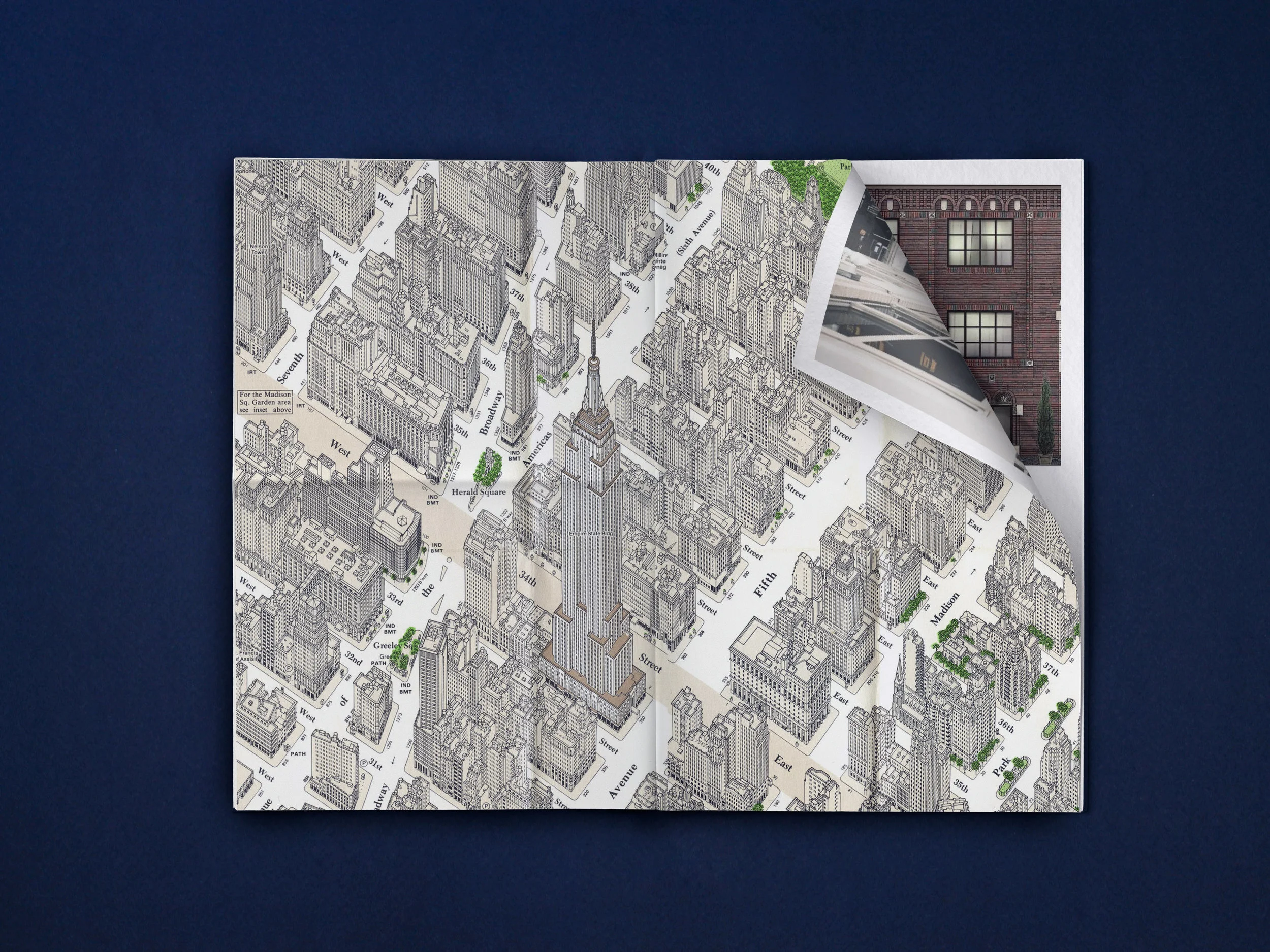
Formerly the Bedford Hotel on 118 East 40th Street, The Renwick debuts as a new hospitality concept that pays homage to the building’s rich history of hosting celebrated creative during their most productive years. Once the site of oversized artist’s studios and lofts, the building later became a long-stay hotel, sheltering residents—including authors John Steinbeck and Thomas Mann—for periods ranging from several months to many years.
The Renwick takes its cues from its former residents, a crowd that was passionately curious, wonderfully eccentric, and eternally expressive. The creative spirit lingers today, and can be felt in every details of the re-imagined Renwick, from the books displayed in each room to the gestural brushstroke featured in the logo. Art in The Renwick is is a lifestyle. The hotel offers no framed artwork, instead spotlighting functional art sourced by local New York City artists. Three-dimensional coat hangers double as enlargened in blots protruding from the walls upon room entrance, and hand-sculpted ceramic pencil holders will sit upon each guest room desk.
James Renwick, born in Manhattan in the early nineteenth century, was one of the most celebrated architects of that time despite never being formally trained. His finest achievement was St. Patrick’s Cathedral, which opened in 1879. Renwick’s robust, elegant name evokes the storied glamour of historic New York City and the commanding power of great art.
Stonehill & Taylor, the design team behind such successes as the Ace Hotel, Crosby Street Hotel, and the NoMad, executed the interior design.

A BLANK CANVAS
The logomark was inspired by a paint splatter of an artist, a scribble of an author, the spark of a great idea.


attention to detail
Typography layout inspired by the vigorous energy of a typewriter, while the notepad lent the perfect opportunity of a blank cavas—a grid-like pattern typically used on artist’s graph paper. The envelope design pays homage to the #10 policy-style of the past.


ICONIC INSPIRATION
Details within the room celebrated some of the exemplary creatives throughout The Renwick’s history, while the interiors translated into customer take-aways, sparking creativity within each person who chooses to stay in The Renwick.


Do Not Disturb signs were reimagined with a twist—paint brushes accompanied by aspiring verbiage.


A LASTING LEGACY
A 28 page sales deck reiterating brand messaging—designed with the highest finishes in mind, complete with gold foiling.